Role
Product Design Lead
Responsibilities
Strategic vision
Product design
Project management
When I joined Spotify, I was in a unique position on product, focusing on Premium, while liaising with the brand team on campaigns. It was a horizontal role, which exposed the fractures in our brand and how that was being applied across different experiences.
I set out to create a vision that would establish a point of view around how to give the Spotify brand a proper home in our Premium web funnel––bringing user sentiment full circle from Campaign to Play.
The result became a narrative tool to influence and formalize a team within Central Design to focus on centralizing and distributing Design Systems at Spotify.
Context
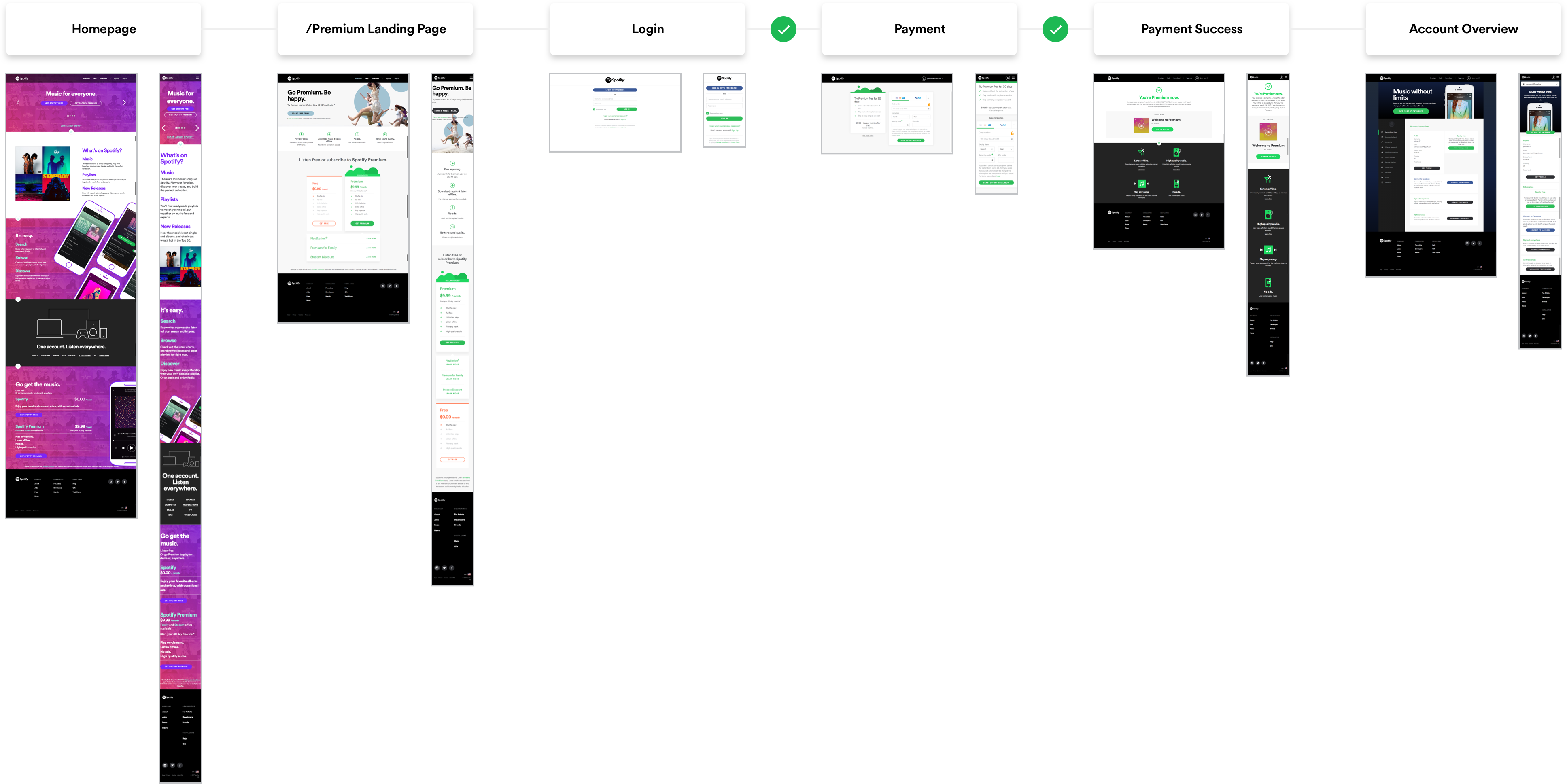
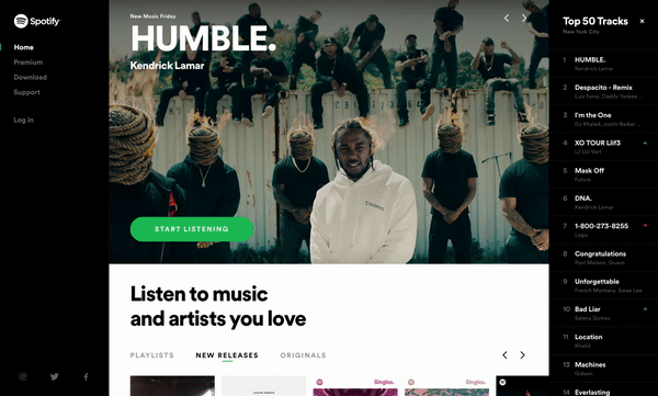
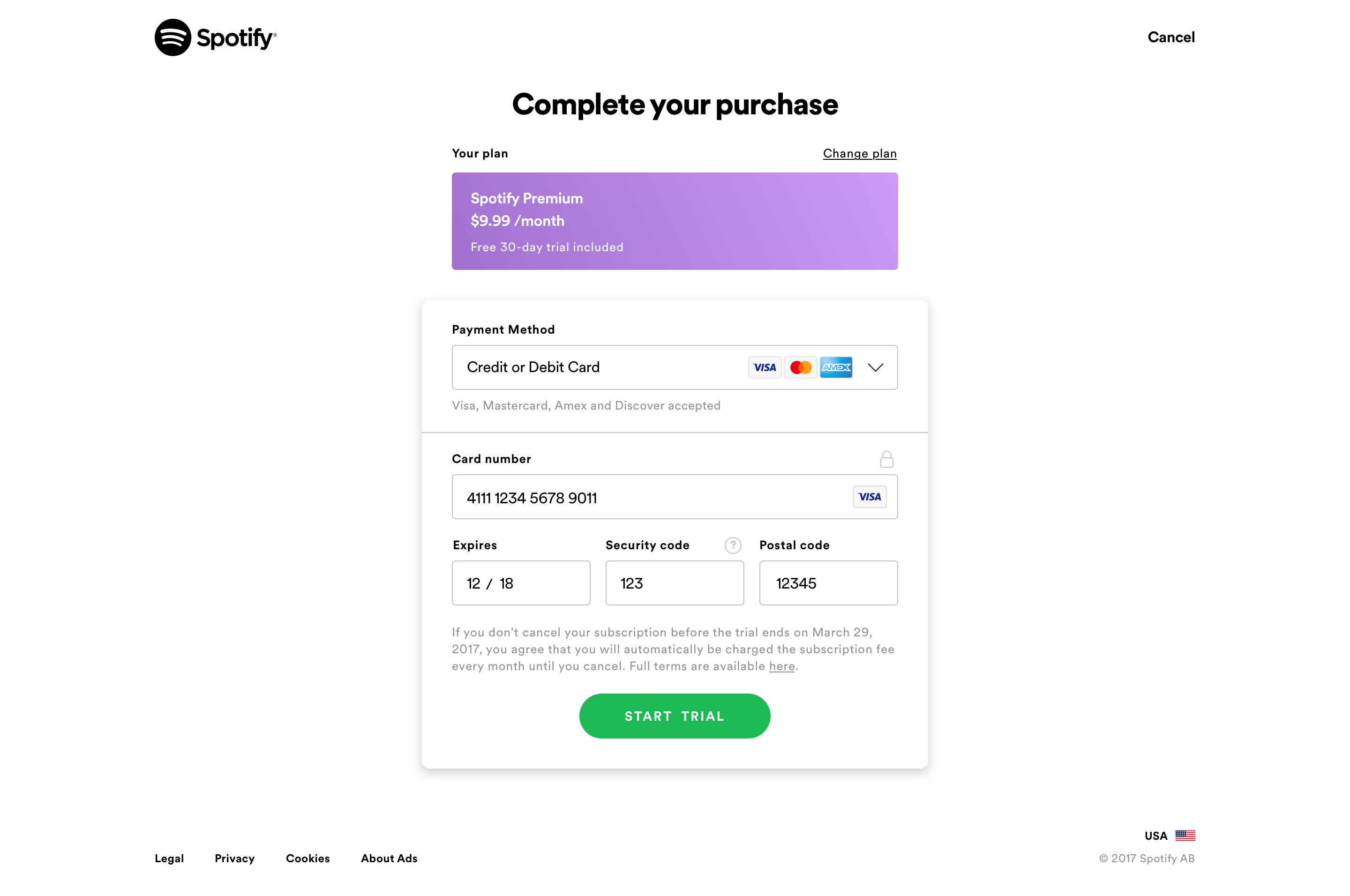
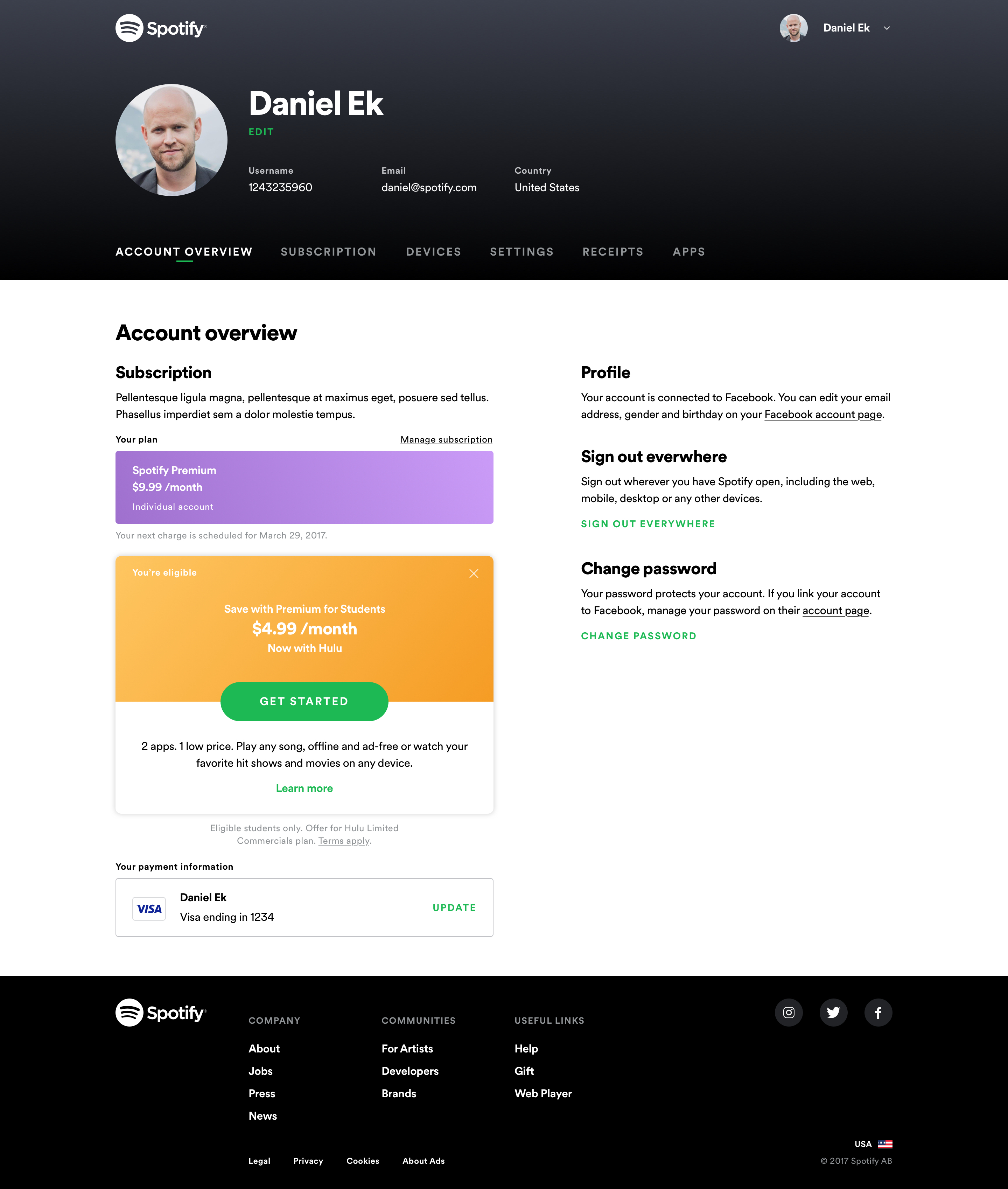
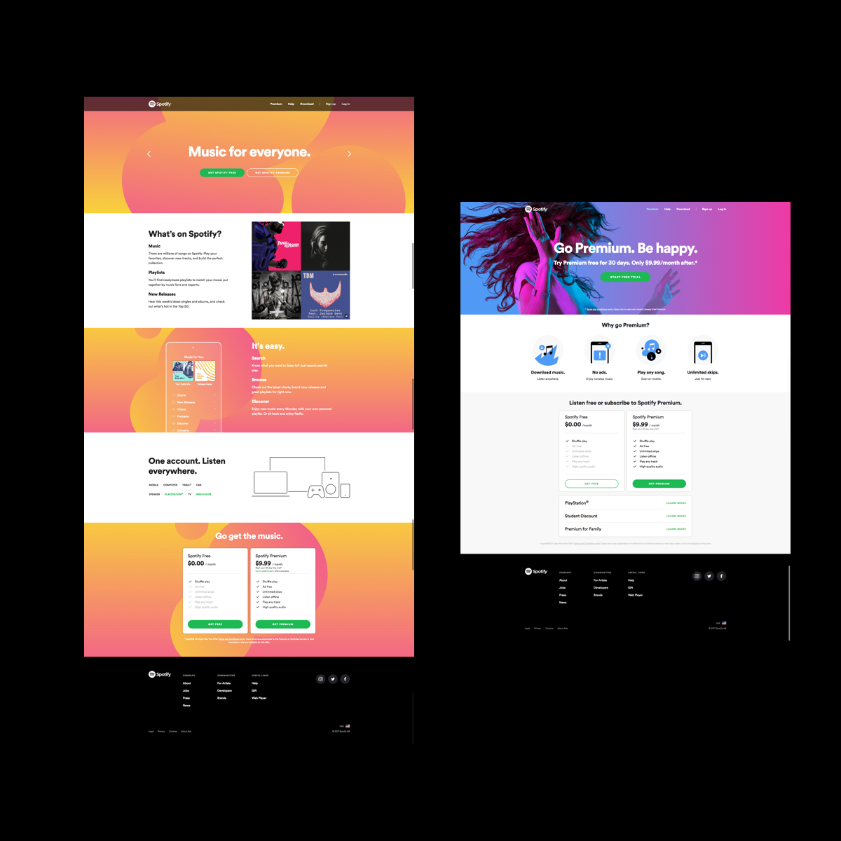
As various revenue product teams worked toward their individual goals, we ended up with fragmented implementations of our web experiences.
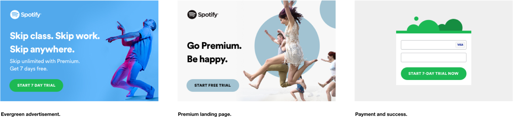
This created fractures in how the brand was perceived by a customer, and even how internal teams reused common elements. At an organizational level, each piece of the flow was built by different teams, which created discrepancies in the execution.
So, how could the product team create a scalable web system that would allow our users to make consistent connections to our brand?
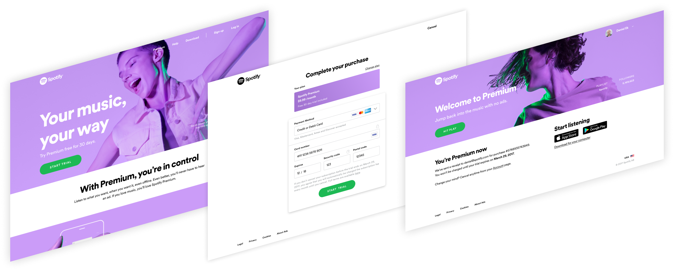
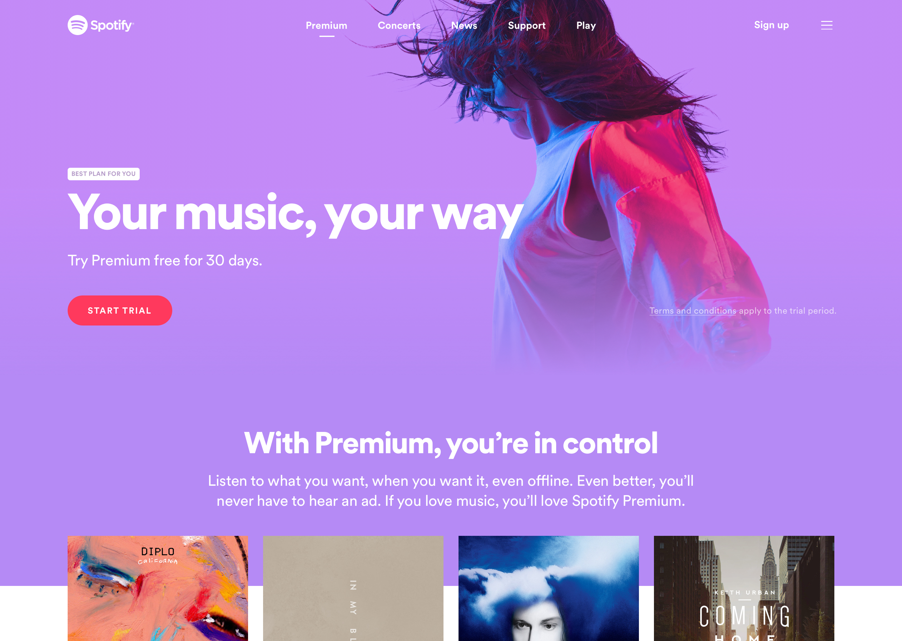
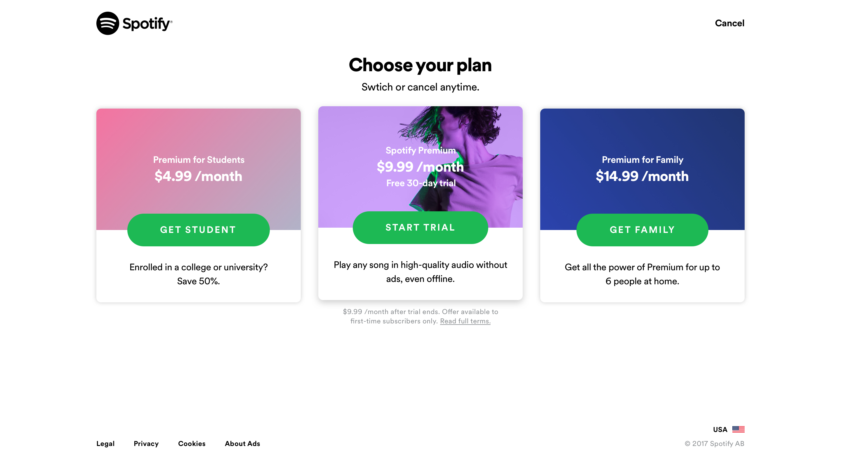
For example, in order to pay for Spotify, users had to go through the website. This made the premium web flow a perfect candidate to provide focus for this vision. Tied to our revenue.
By analyzing data for the month of February 2017, the Growth team learned that a majority of the traffic were new visitors or existing visitors were looking for music. Sessions didn't last long and interactions were limited.
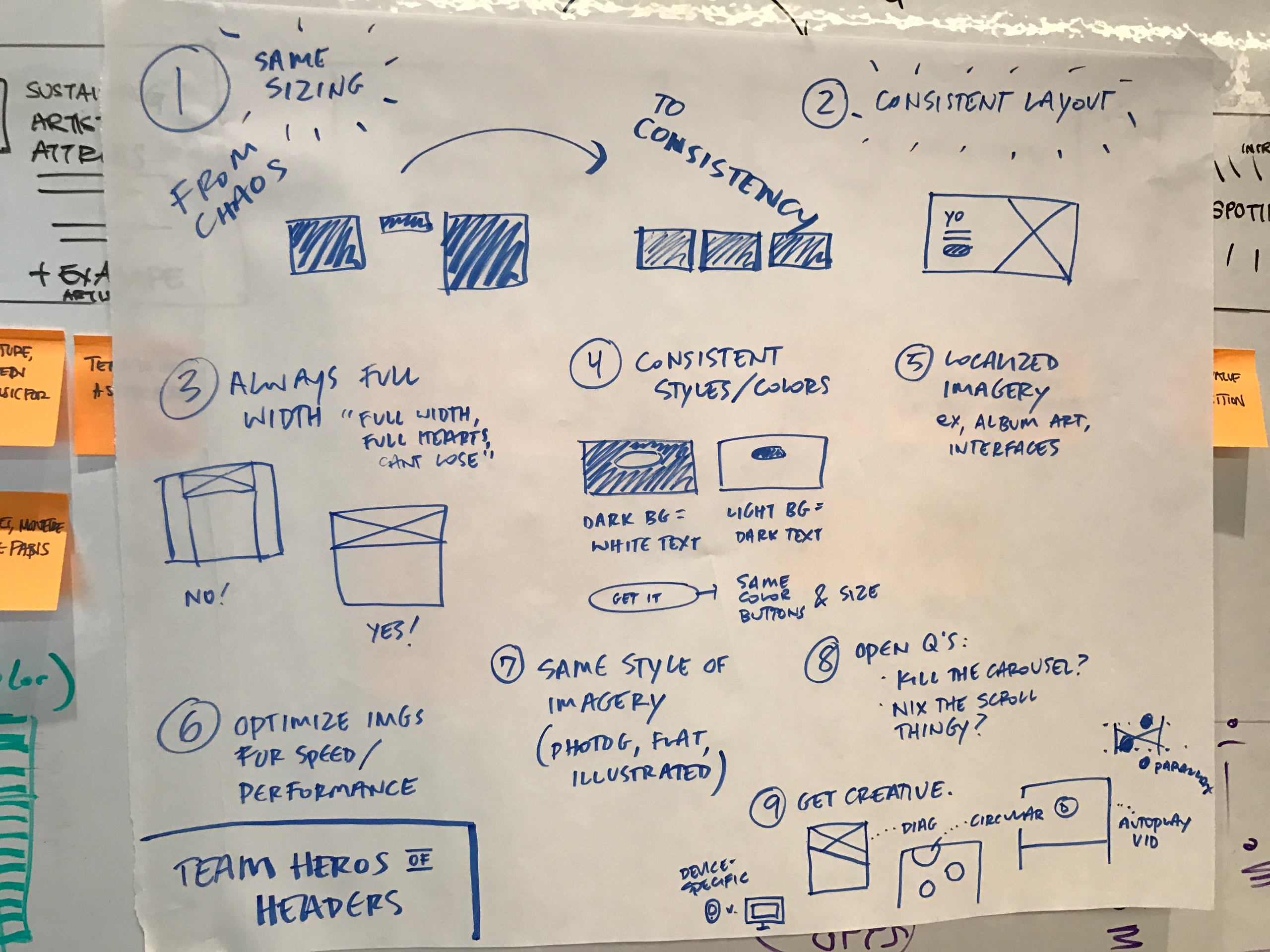
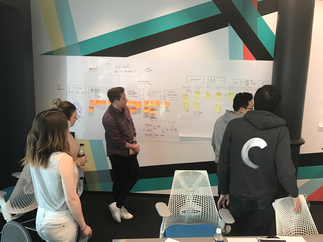
I facilitated a global workshop with cross-functional partners to identify inconsistencies in our brand and componentry, prioritize focus for an MVP, and create a shared perspective around brand elements in product.
Key Takeaways
→ There were language inconsistencies in how we communicated Spotify Plans
→ No interactive or playable elements on onjects visitors expected to play
→ Misinterpretations or old assets from the Spotify brand
→ Several different versions of components and styles leading to accessibility issues
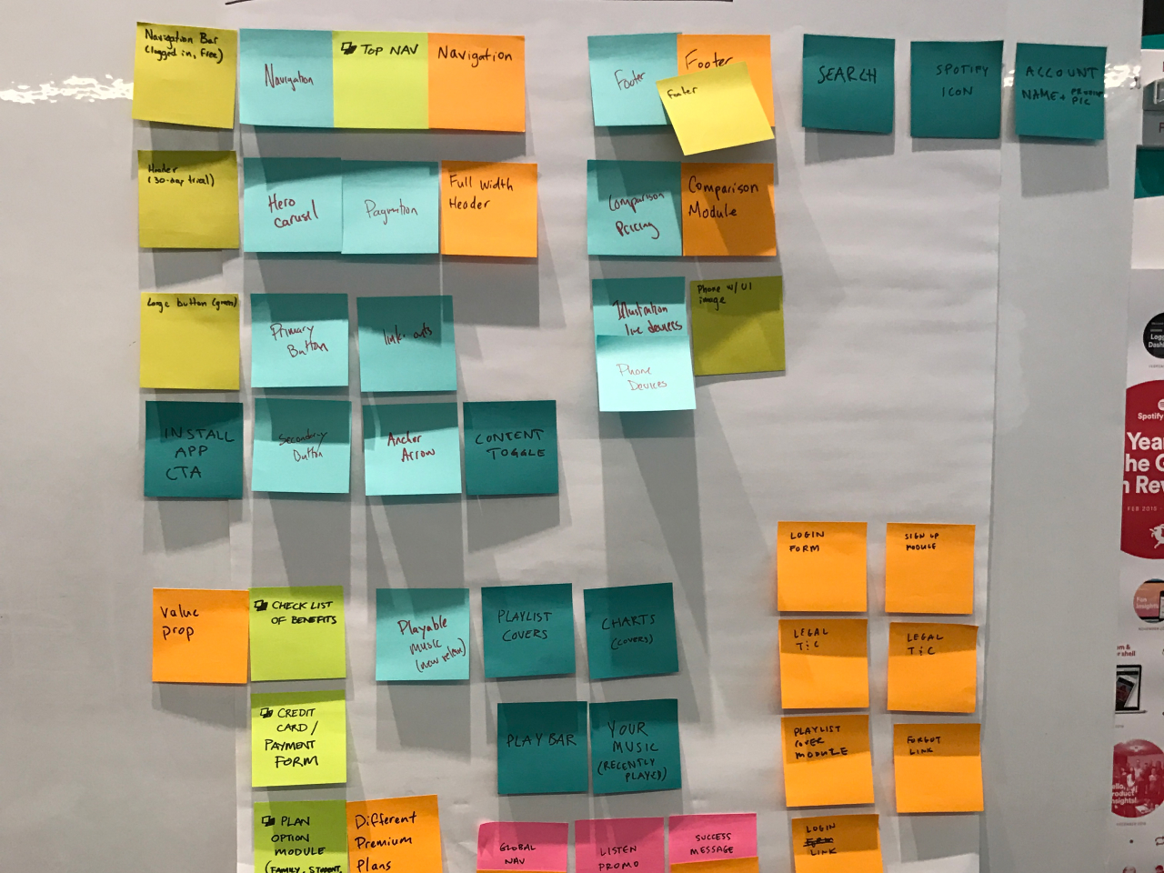
Conceptual development
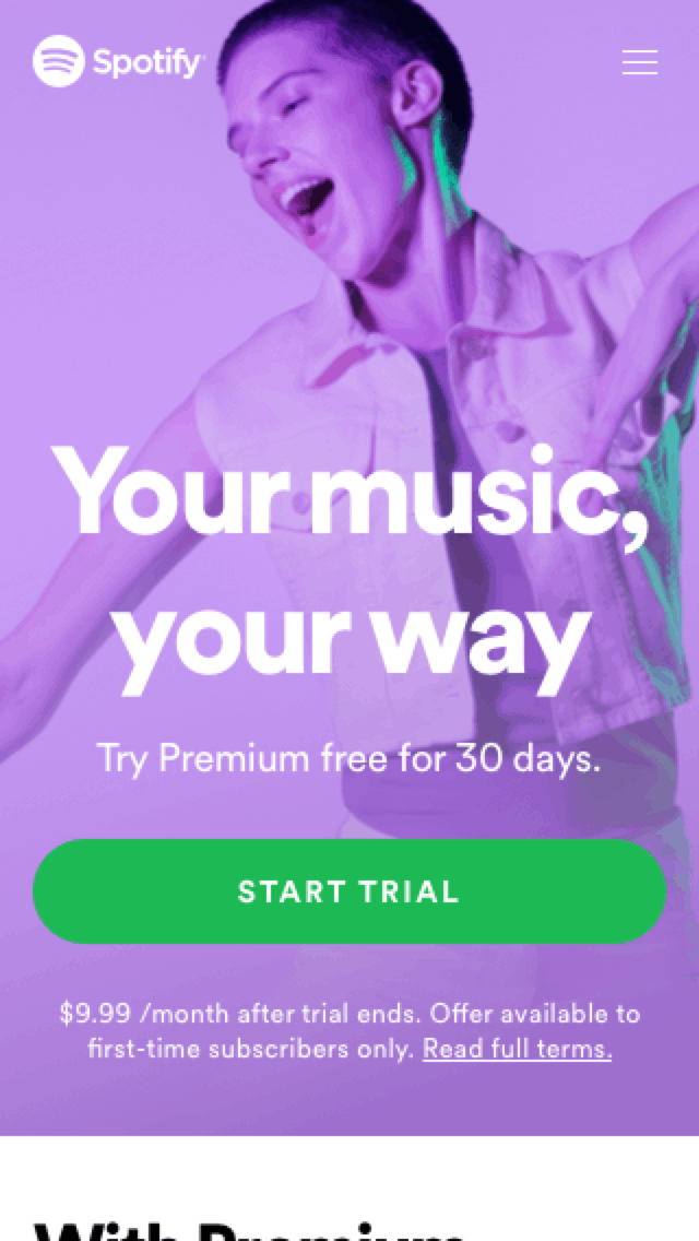
Set the tone for how to design with new brand elements: leveraging creative photography, color, and language.
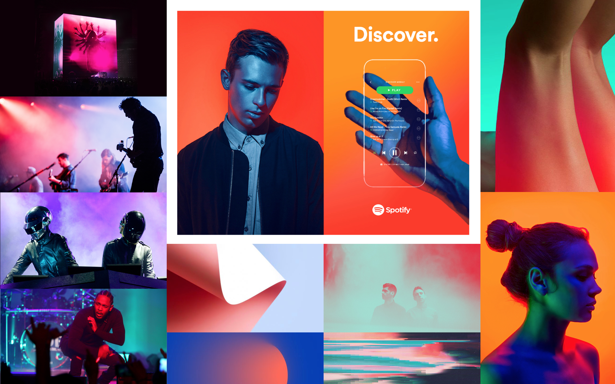
The Brand team, Chelsea Alburger and Erik Herrstrom, gave an overview of the current state of the Premium branding work. We all partnered up to explore how we can create an inspirational base to guide the flow into reality as I moved forward.
Based on the workshops, I worked with Tamara Hilmes, a UX Writer, to define three themes to guide creative explorations:
→ Contextual
Keep in mind who a user is and where they are within the flow.
→ Simple
Users should get what they came for, easily.
→ Engaging
If users explore, content should be discoverable.
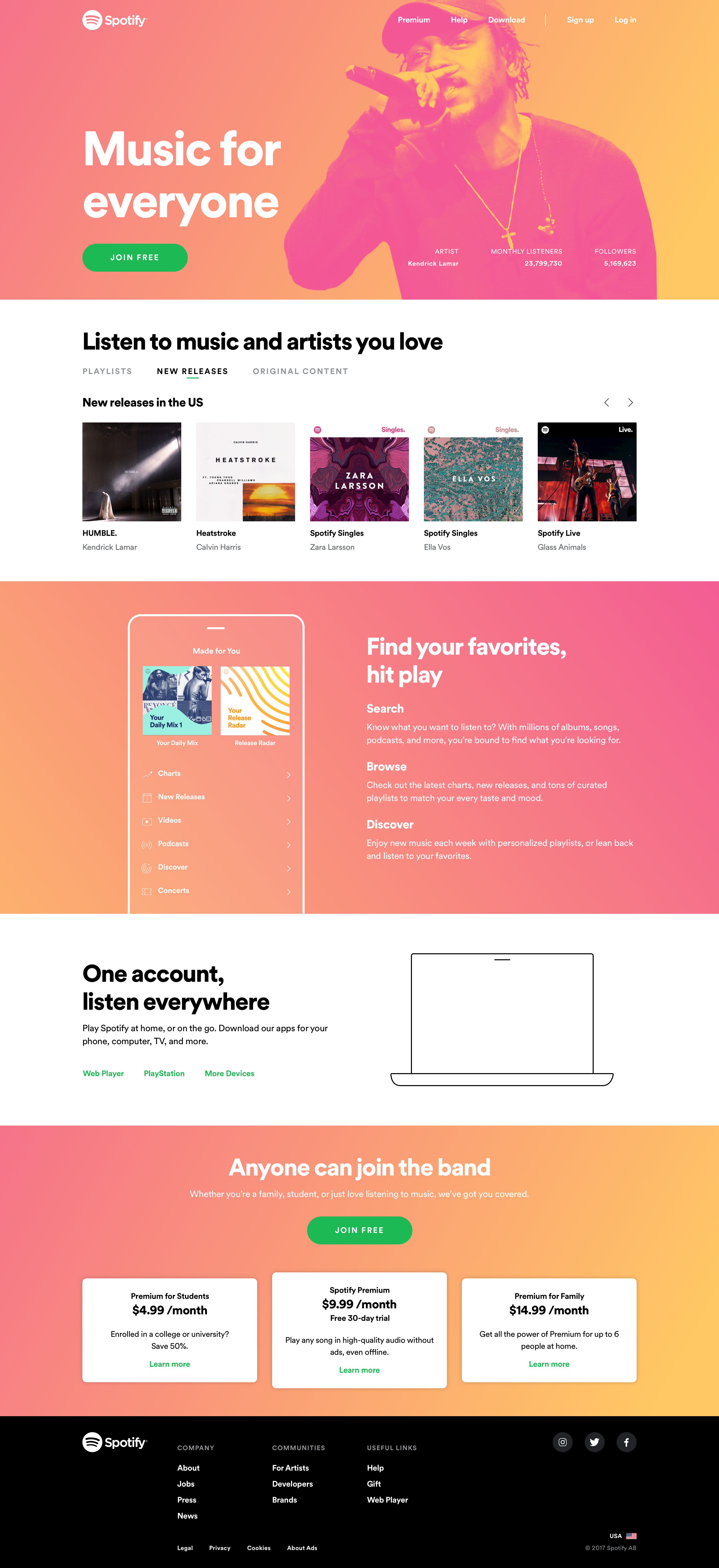
I focused on how we can celebrate the content that Spotify provides, taking inspiration from editorial formats within the music industry and our product experience.
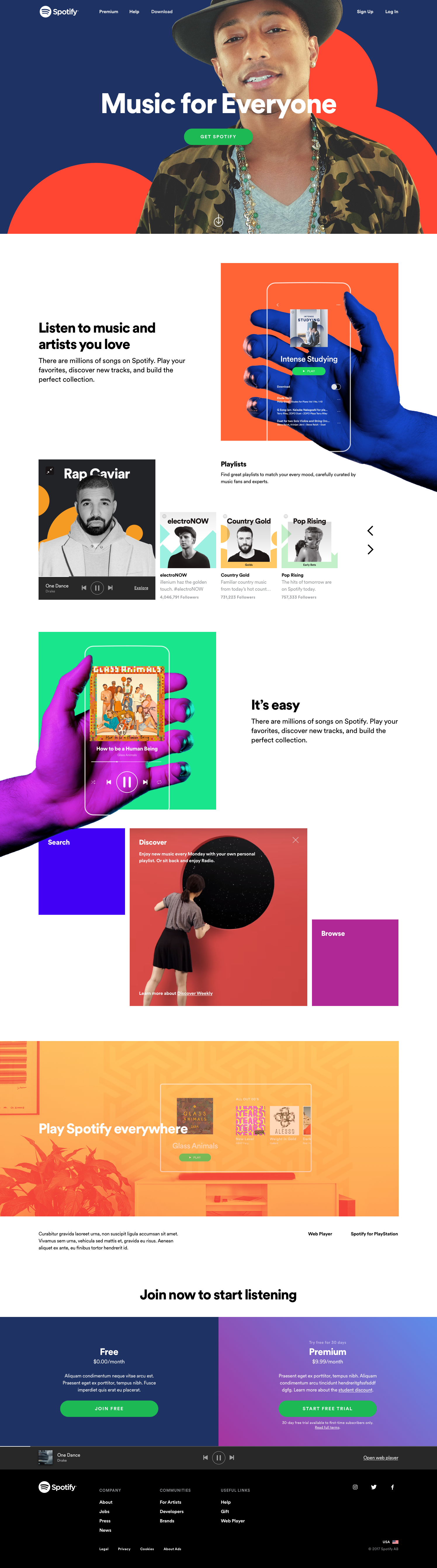
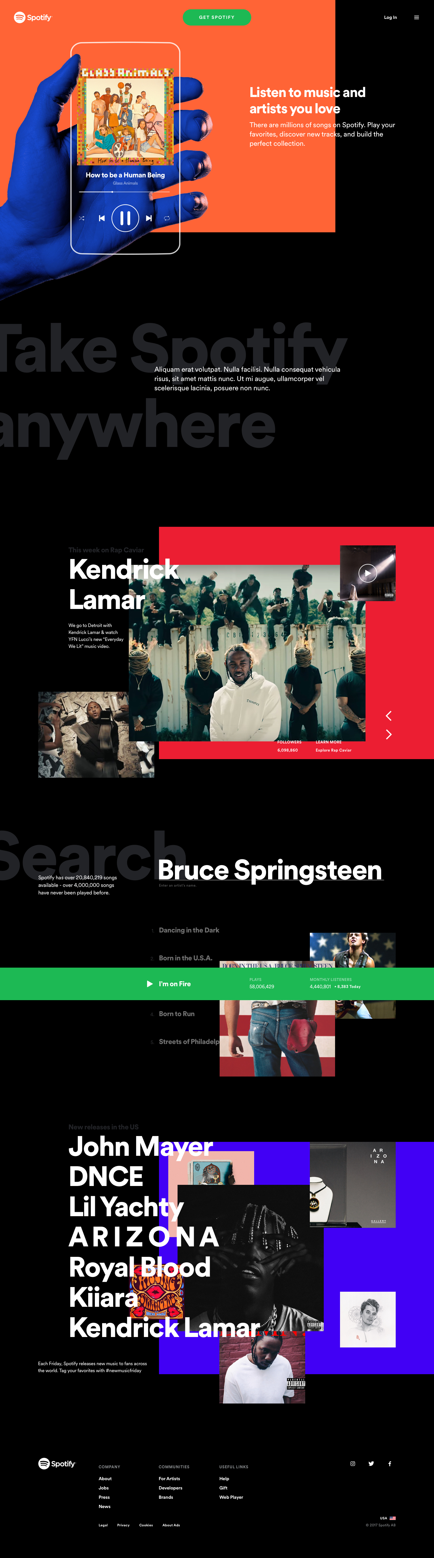
To change gears, I explored making Spotify.com a destination for more than Premium. A place to discover music, learn more about artists, and pay for the plan that makes sense for a fan.
This could create additional opportunities with artists to uplevel their content and create a place to drive additioanl editorial based revenue with labels.
I was also curious how to bring fans closer to music. This could help build consistent expectations and streamline how teams work together by leveraging shared elements. Ultimately, this was too drastic of a proposal, but was tested by the Growth team.
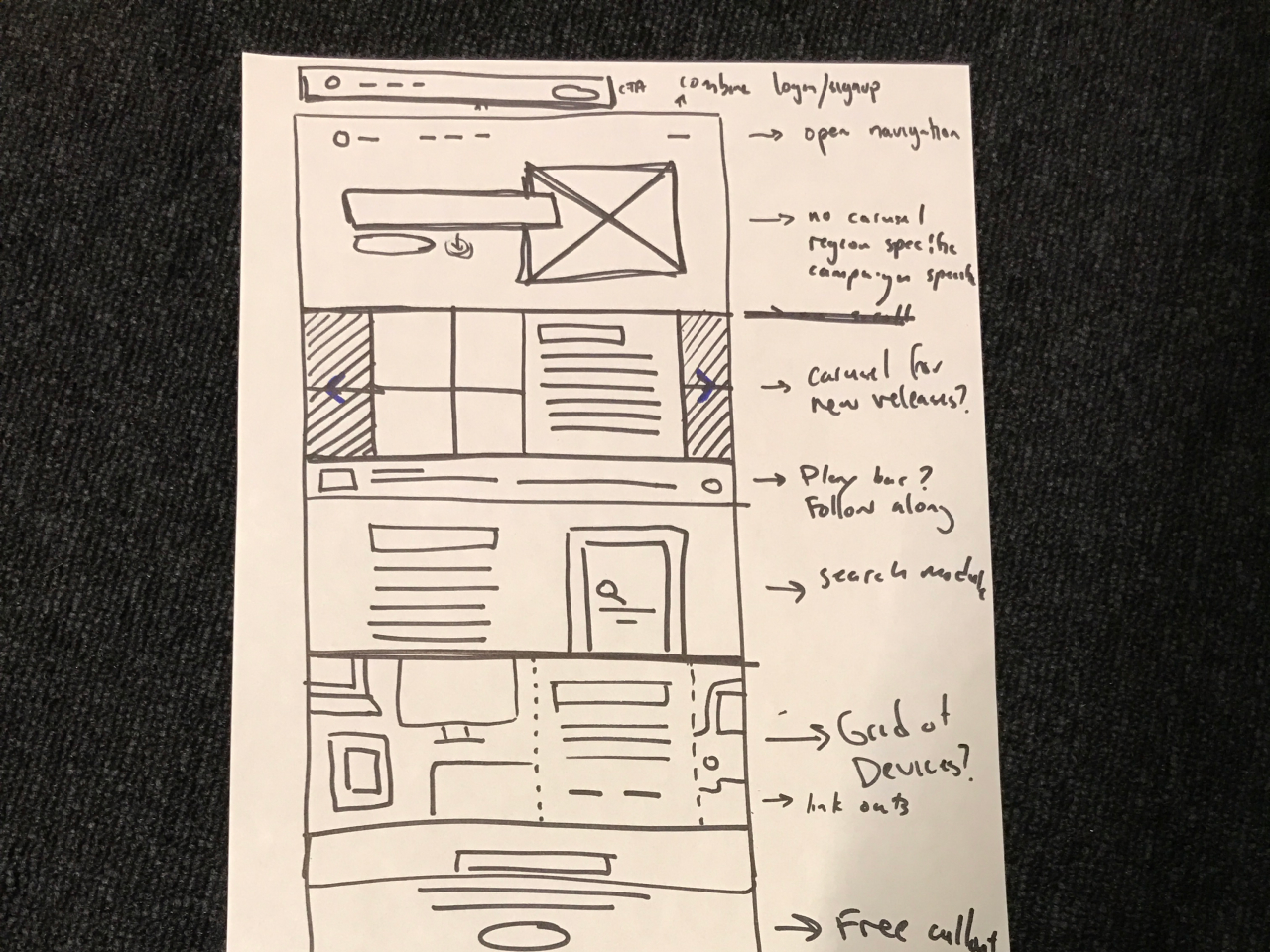
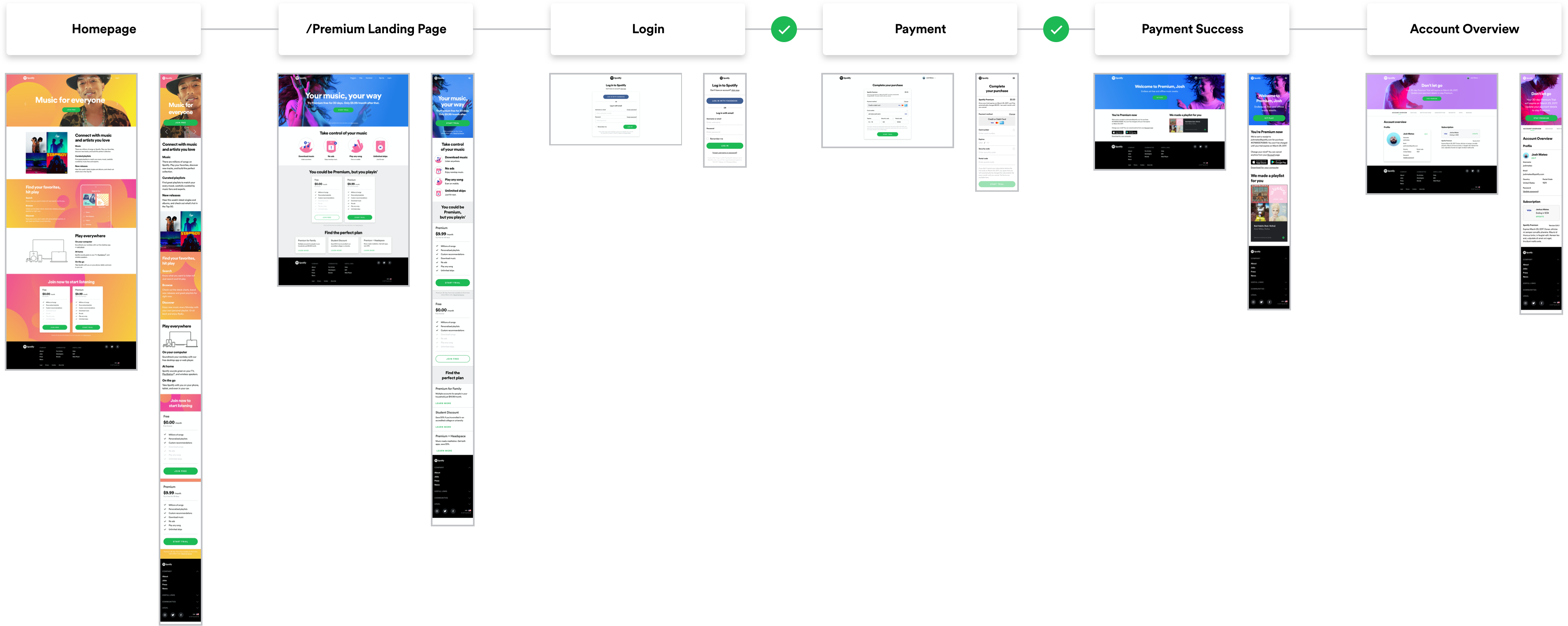
Prototyping
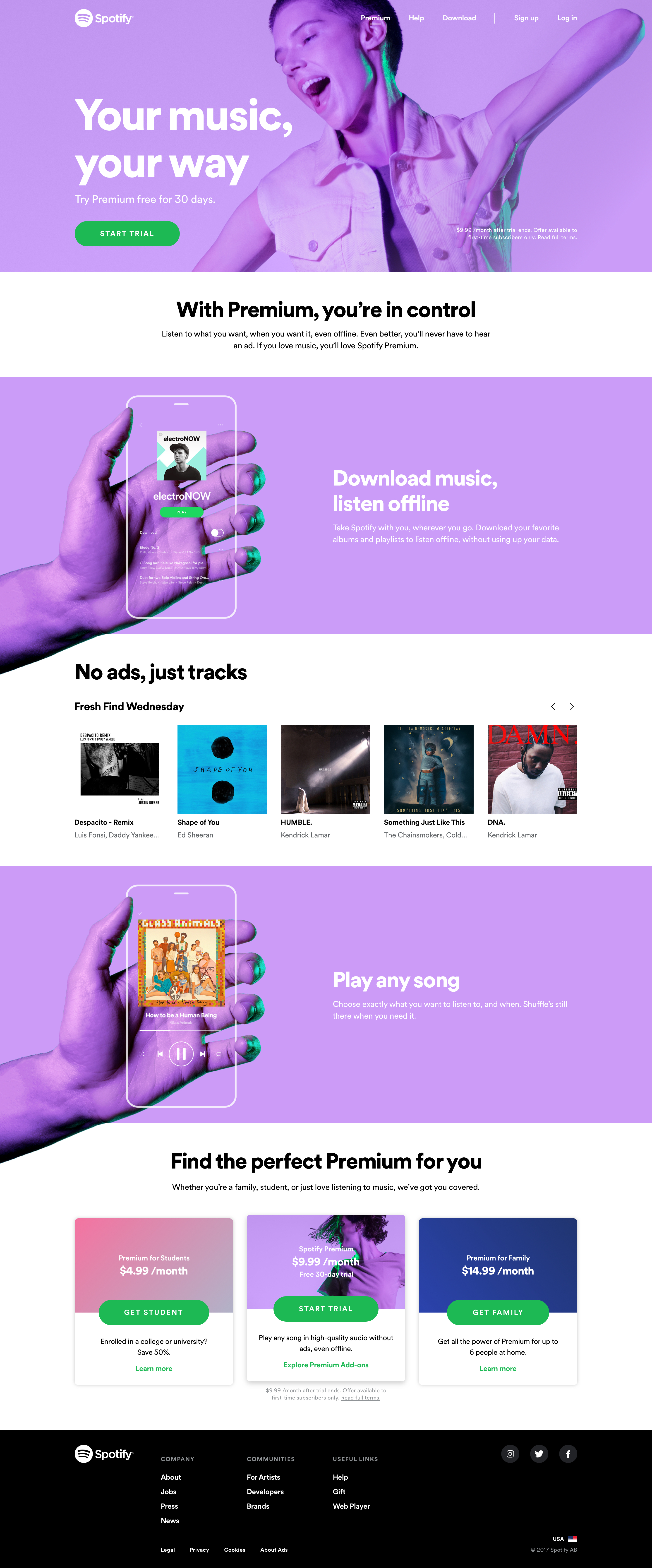
Building prototypes helped the team validate the concept and demonstrate the potential of a music-driven experience.
Language was a crucial element that was unlaigned throughout the experience. Tamara Hilmes curated a story to redefine the premiuim narrative and pair that back with the visuals.
Outcome
By creating a shared perspective in design, we were able to create a tighter relationship between the brand vision and what's technically feasible in product.
When I looked beyond the MVP, there was a supportive, technical layer that would help us scale for the future.
Key Takeaways
→ Interactive content that ties back to data from Spotify
→ A skeletal system that can support a variety of different asset types and data
→ Reusable styles and components that can be used across business areas
→ Adaptive formats to leverage the different ways a vistor could exprience Spotify.com
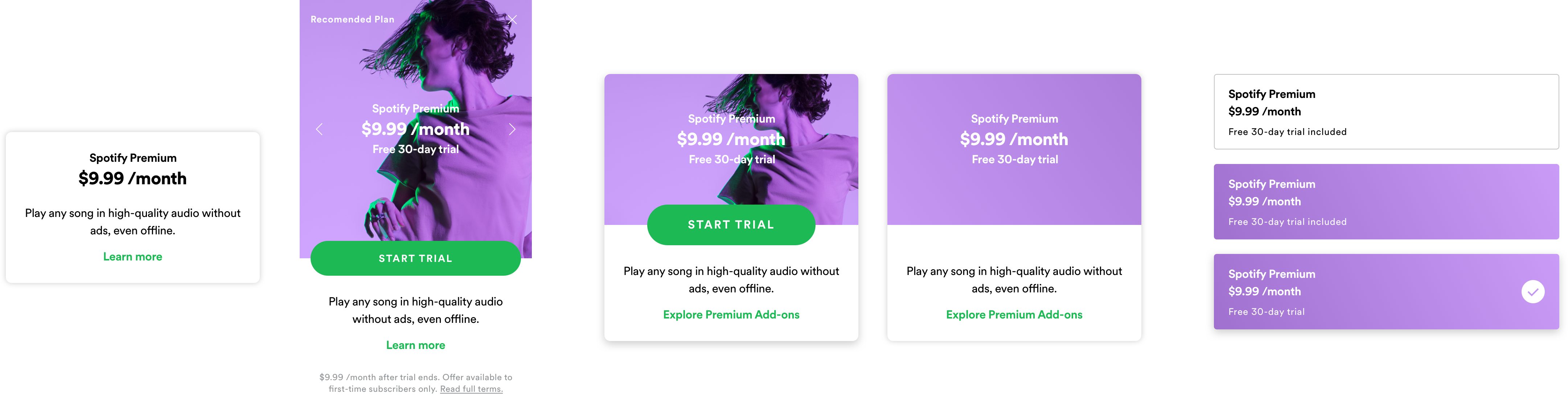
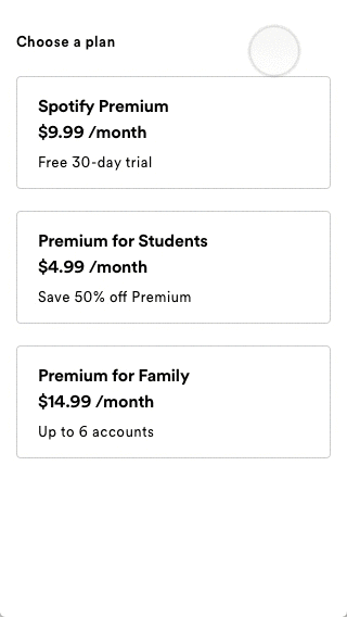
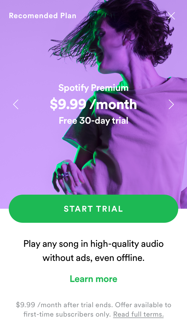
Creating adaptive components, like cards, were a way to merchandise Spotify Premium offerings. Additionally, these could become a brandable element for users to connect with through their payment experience and into the Consumer product.
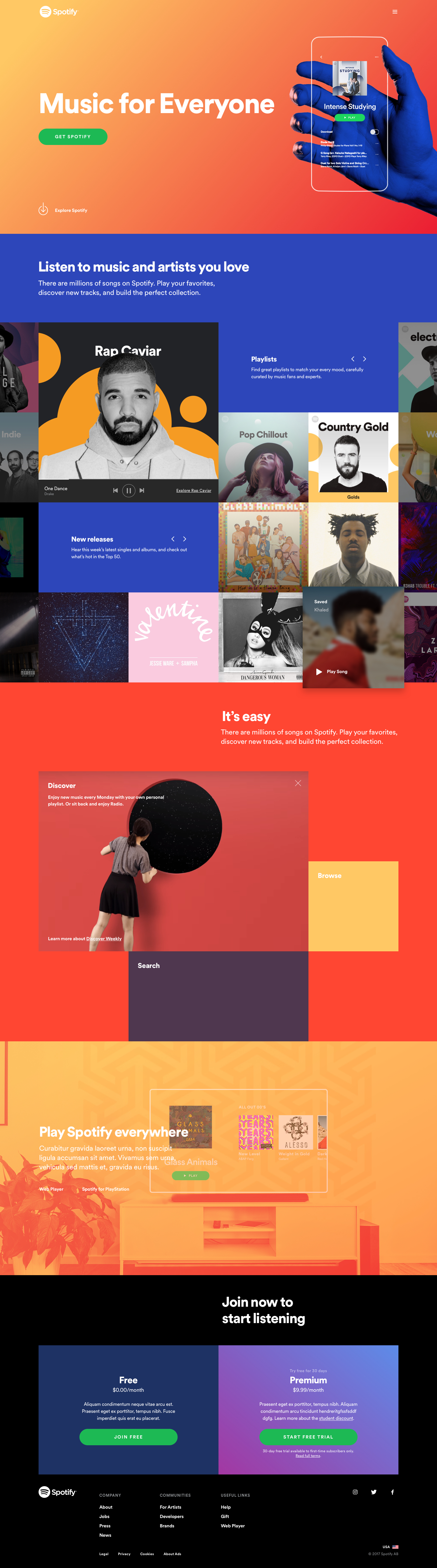
To reinforce how this design can live in a responsive world, I also designed a mobile web variant. Using adaptive design techniques, the end result was more aligned patterns across mobile experiences to lower cognitive load on users.
Impact
Creating an inclusive working environment helped reinforce the paradigm shift for the future of Design Systems at Spotify.
Since cross-functional teams were involved from the beginning, they were invested in the shared outcome from this vision.
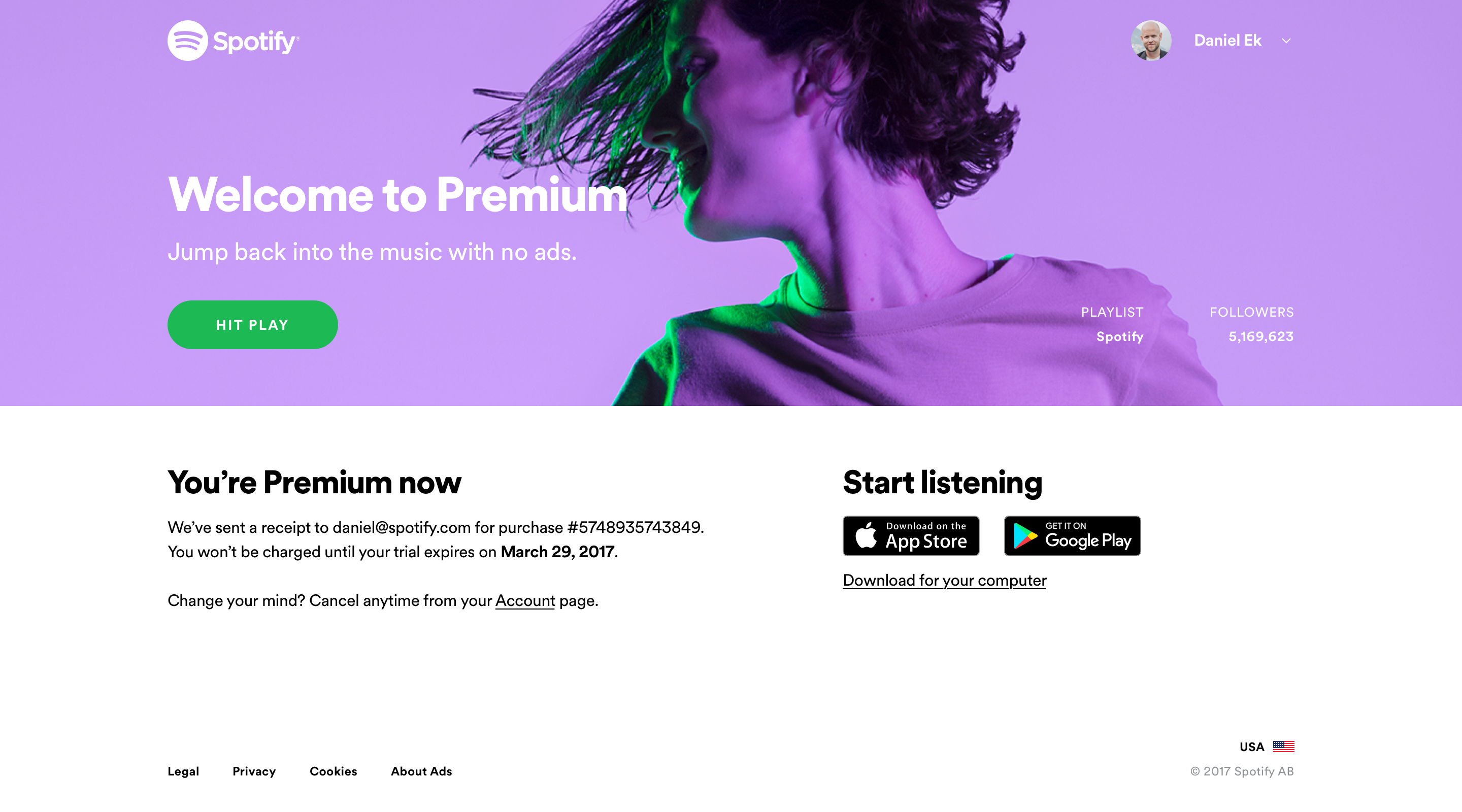
The Growth team leveraged the consolidated visual foundation to run a baseline test. There was an increase in Premium upgrades, more people scrolled past the "fold", and there was a significant increase in plays in the Web Player.
Additionally, the team also constructed reusable cards in React, moving away from Bootstrap, to help create a tighter relationship between our Home and Premium pages. This reduced the product cost to test new plan formats.
A community ensures that teams are bought in under a shared point of view. This creates leverage for more efficient change that is rooted in concrete brand foundations.
This vision was used to influence and formalize a team within Central Design to focus on centralizing and distributing Design Systems at Spotify.